
- Creating and Publishing a Form
- Conversational Form
- Create Multi Step Forms In WordPress
- Using Calculations in SureForms: A Step-by-Step Guide
- Calculation Formula Guide
- SureForms Login Block – Step-by-Step Guide
- SureForms Registration Block – Step-by-Step Guide
- SureForms – PDF Generation Feature
- GDPR Compliant Forms
- Create WordPress Forms With Conditional Logic
- Adjust Form Notification Emails
- Form Confirmation
- Entries Management Feature Guide
- How to Add Query Parameters to Form Redirects
- How to Fetch Query Parameters from URL
- Set the “From Email” in SureForms
- Setting Up “Reply-To” Email Using Form Input Tags – SureForms
- Restrict Form Entries in SureForms
- Form Scheduling in SureForms
- Conditional Confirmations in SureForms
- How to Connect Your Stripe Account with SureForms
- How to Connect PayPal in SureForms
- How to Create a Payment Form in SureForms
- SureForms Payments
- How Refunds Work in SureForms Payments
- Understanding Payment Processing Fees
- How to Display the Payment Dashboard on the Frontend (SureForms)
- Enable One-Time Payment and Subscription in a Single Form
- SureForms Integration with ActiveCampaign
- SureForms Integration with AgileCRM
- SureForms Integration with Airtable
- SureForms Integration with LatePoint
- SureForms Integration with FluentCRM
- Connect SureForms To Zapier
- WordPress Forms with the Custom App Builder
- SureForms Integration with Telegram
- SureForms Integration with Breeze
- SureForms Integration with Brevo
- Unable to Upload SureForms ZIP: File Unzipped On Download
- Browser Support for SureForms
- Not Getting Update Notifications
- How To Rollback to Previous SureForms Versions
- Publishing Failed: Invalid JSON Response
- Troubleshooting Email Sending In SureForms
- SureForm Submissions Marked as Spam – How to Fix
- API Request Failed – Nonce Verification Error
- Fixing the “Destination folder already exists” Error When Installing SureForms
- How to Set Up SureForms with Caching Plugins
- srfm_enable_redirect_activation
- sureforms_plugin_action_links
- srfm_quick_sidebar_allowed_blocks
- srfm_integrated_plugins
- srfm_suretriggers_integration_data_filter
- srfm_form_submit_response
- srfm_enable_gutenberg_post_types
- srfm_languages_directory
- srfm_form_template
- srfm_disable_nps_survey
SureForms Styling Options in the Gutenberg Block Editor
Style your SureForms forms directly from the WordPress block editor. No custom CSS is needed.
Overview
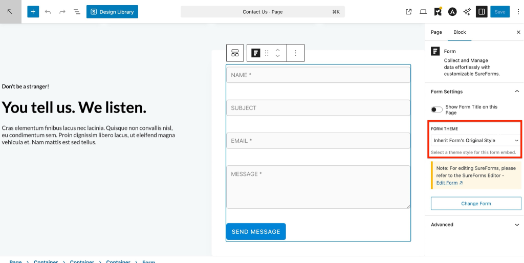
SureForms works seamlessly inside the WordPress block editor (Gutenberg). When you add a SureForms form to any page or post, the block comes with a built-in Style panel. This panel includes a set of visual controls that let you customize how your form looks from the editor sidebar.
You can adjust spacing, colors, borders, and more, all without writing a single line of CSS.
- Inherit Form’s Original Style: This option fetches and applies the existing style of your form automatically.
- Default: Provides basic styling options to customize your form with simple controls.
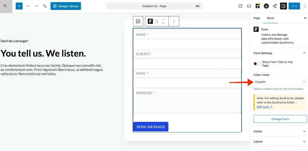
- Custom: Unlocks advanced styling controls for full design flexibility. (Available in Pro)
Prerequisites
Before you get started, make sure the following are in place:
- SureForms plugin is installed and activated on your WordPress site
- A WordPress site running the block editor. No extra plugin is needed since Gutenberg is the default editor
- At least one form has already been created in SureForms (go to SureForms → Add New if you have not created one yet)
- (For Custom Styling only) An active SureForms Premium license.
How to Add a SureForms Form in Gutenberg
Follow these steps to embed your SureForms form on any page or post:
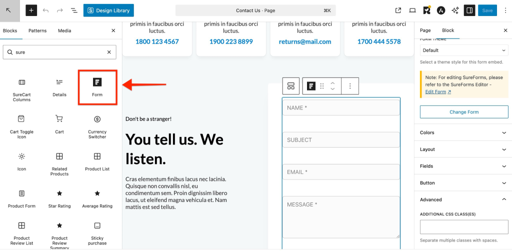
- From your WordPress dashboard, open an existing page or post, or create a new one to launch the block editor.
- Click the + (Add Block) button in the top-left corner of the editor, or click the + icon that appears between blocks.
- In the block search field, type SureForms or Form.
- Click the SureForms Form block to insert it onto the page.
- With the block selected, go to the right-hand sidebar and locate the Select a Form dropdown.
- Choose the form you want to display.
- Your form will appear on the canvas. Click the Style tab in the right sidebar to start customizing.
Styling Options
With the SureForms block selected, click the Style tab in the right sidebar. The panel is organized into collapsible sections.
Default Styling (Free)
- Color
- Layout
- Fileds
- Button
Color
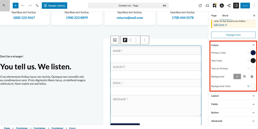
With this option, you can control the overall look and feel of your form by customizing its colors and background.
You will find the following settings:
- Primary Color – Sets the main color used for buttons and important elements.
- Text Color – Defines the color of the form text.
- Text on Primary – Controls the text color that appears on primary elements like buttons.
- Background Color – Sets a solid background color for the form.
- Background Image – Allows you to add an image as the form background.
- Background Gradient – Lets you apply a gradient background for a more modern look.
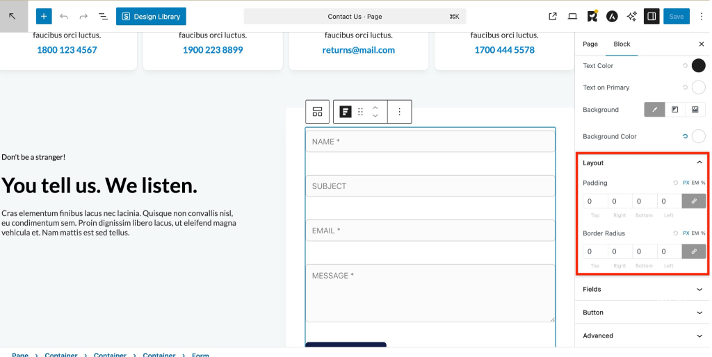
Layout
Control the spacing and corner shape of your form elements.
- Padding – Adds space inside the element (Top, Right, Bottom, Left). Supports px, em, and %.
- Border Radius – Rounds the corners of elements (Top, Right, Bottom, Left). Supports px, em, and %.
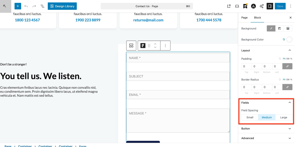
Fields
Control the spacing between form fields for better layout and readability.
- Small – Minimal spacing
- Medium – Balanced spacing (default)
- Large – More space between fields
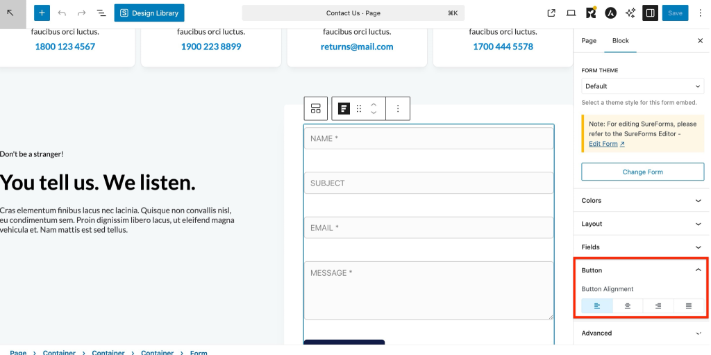
Button
Control the alignment and width of the form button.
- Left – Aligns the button to the left
- Right – Aligns the button to the right
- Center – Places the button in the center
- Full Width – Expands the button to take the full width of the form
Custom Styling (Pro)
This section requires a SureForms Pro license.
Advanced styling gives you full control over the design. All controls support responsive settings.
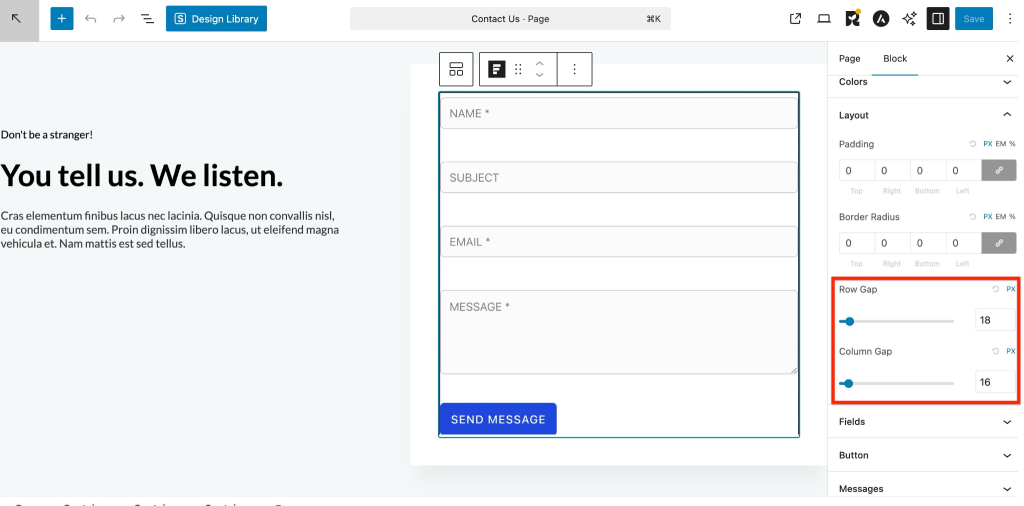
Layout Controls
- Row Gap: Vertical space between fields
- Column Gap: Horizontal space between fields in multi-column layouts
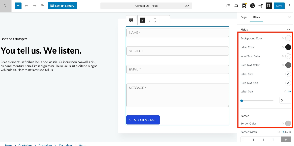
Field Styling
Customize the appearance of individual form fields, including colors, text, and spacing.
- Background Color – Sets the background of the field
- Label Color – Defines the color of field labels
- Input Text Color – Sets the color of the text entered by users
- Help Text Color – Controls the color of helper or hint text
Label Size
- Font Size – Adjust label text size (px, em)
- Line Height – Control spacing between lines
Help Text Size
- Font Size – Adjust help text size (px, em)
- Line Height – Control spacing between lines
Spacing
- Label Gap – Sets space between the label and the field (px)
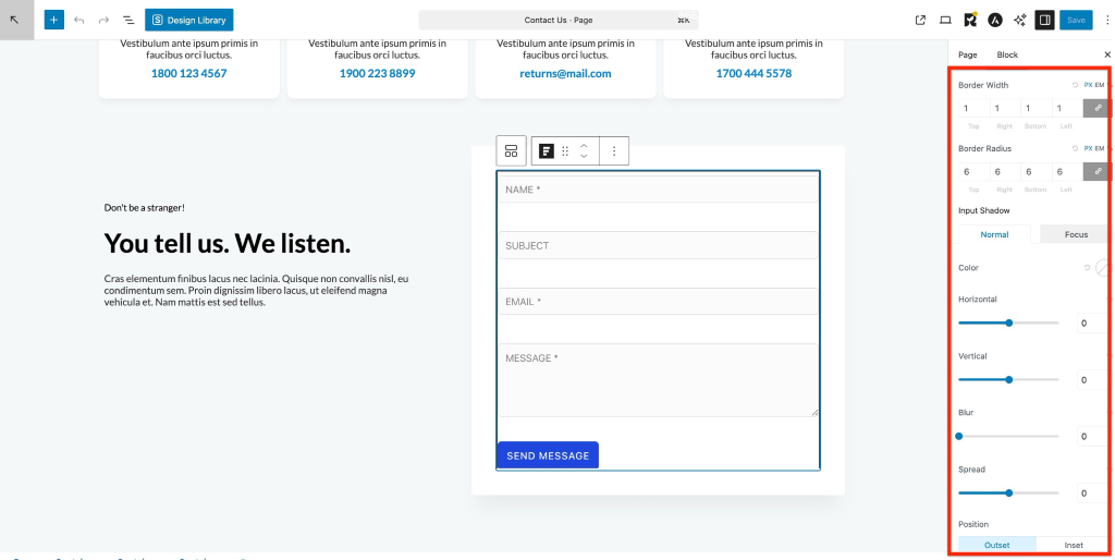
Border
- Border Color – Defines the color of the field border
- Border Width – Set border thickness (px, em, %) for:
- Top, Right, Bottom, Left
- Border Radius – Control corner roundness (px, em, %) for:
- Top, Right, Bottom, Left
Input Shadow
Add shadow effects to the input field for better visual depth.
- State – Choose between Normal and Focus
- Color – Sets the shadow color
- Horizontal – Adjust horizontal shadow position
- Vertical – Adjust vertical shadow position
- Blur – Controls the softness of the shadow
- Spread – Expands or contracts the shadow size
- Position – Choose Outset (outside shadow) or Inset (inside shadow)
Button Styling
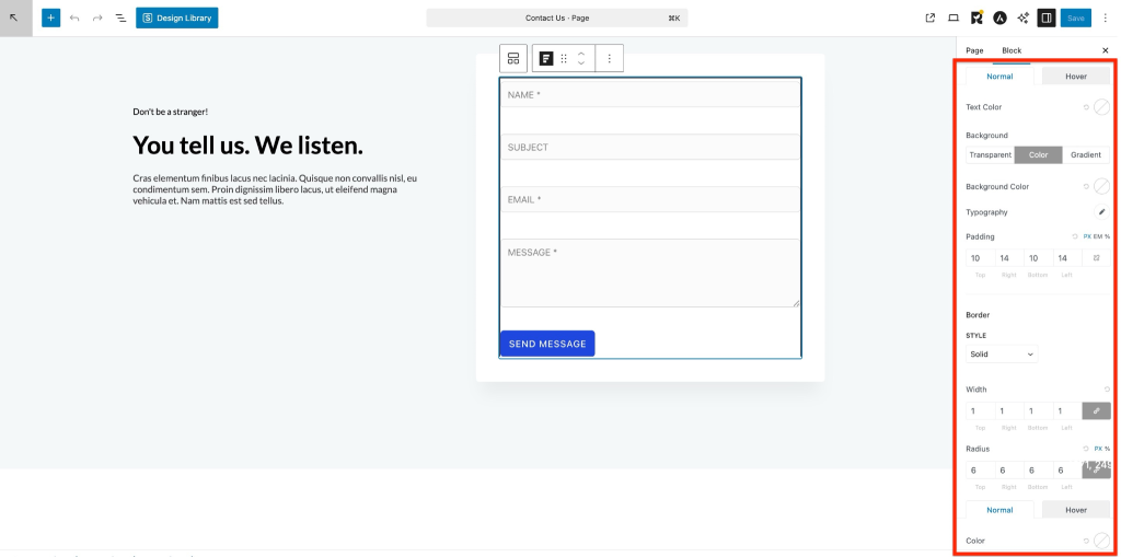
Customize the appearance of the button for both normal and hover states.
Colors
- Text Color – Sets the button text color
- Background – Choose the button background type:
- Transparent
- Color
- Gradient
Typography
- Customize the button text style (Font Size, Line Height)
Padding
- Control the space inside the button using px, em, or %: Top, Right, Bottom, Left.
Border
- Style – Set border style (e.g., Solid)
- Width – Define border width for each side (Top, Right, Bottom, Left)
- Radius – Control corner roundness (px, %) for each side
- Color – Set border color for Normal and Hover states
Error Message Styling
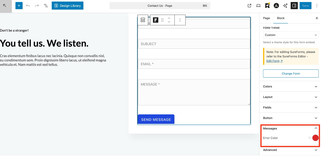
Control how validation errors appear.
Colors
- Error Text Color
SureForms makes it easy to style forms directly inside the WordPress block editor.
We don't respond to the article feedback, we use it to improve our support content.